Mission-Based Branding
Behind the brand
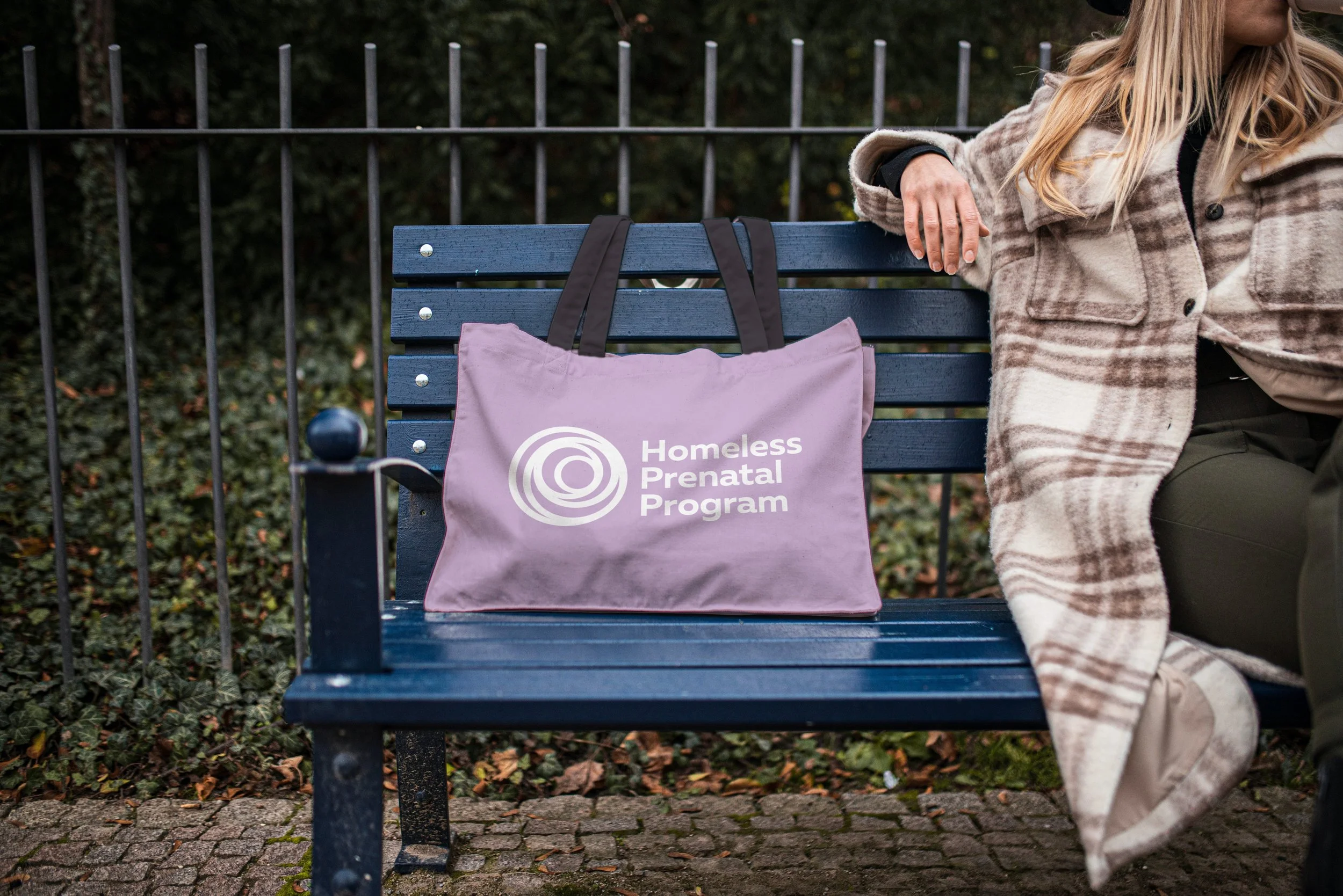
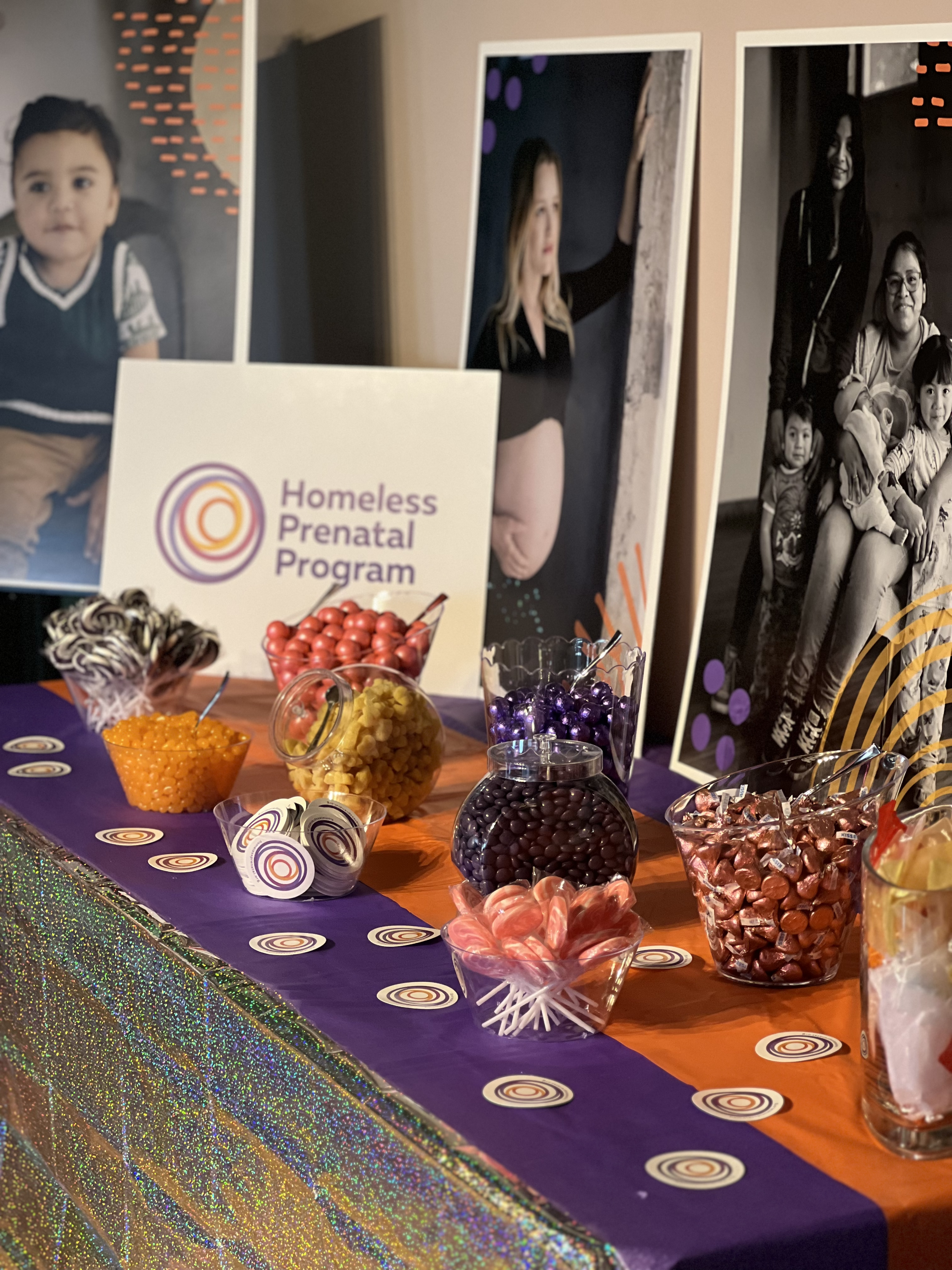
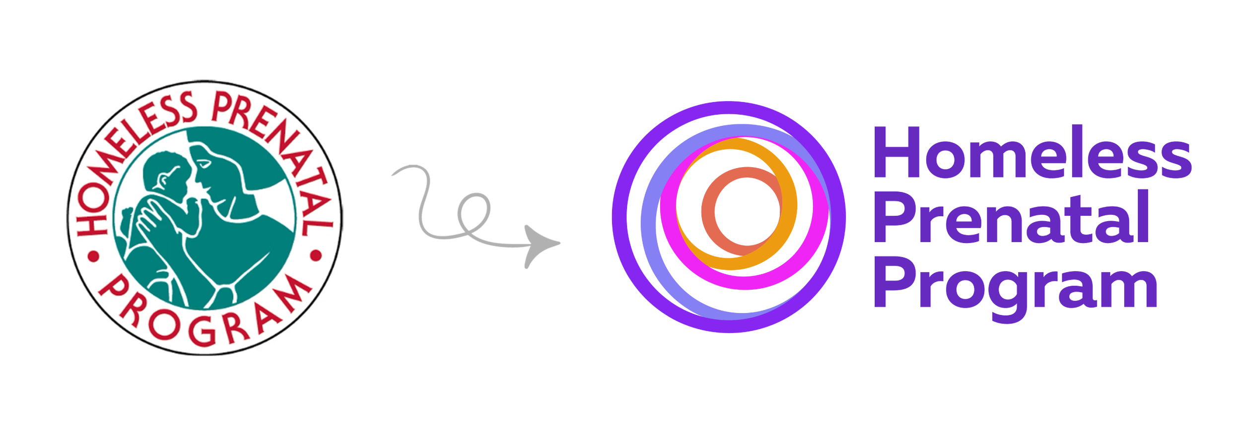
In 2023, the Homeless Prenatal Program (HPP) debuted its new logo and brand identity after 34 years of serving families in San Francisco.
Having witnessed so much agency growth since I was first hired, I knew rebranding a nationally recognized nonprofit would be no simple task. This project deepened my understanding of the organization in unexpected ways. The experience was transformational as I bridged the organization's history, present, and future. From researching and hiring an agency to all aspects of planning, meeting with stakeholders, conducting surveys, styling photography, writing website copy, and mapping client needs, I tried to absorb every possible detail the 30-year-old institution could offer.
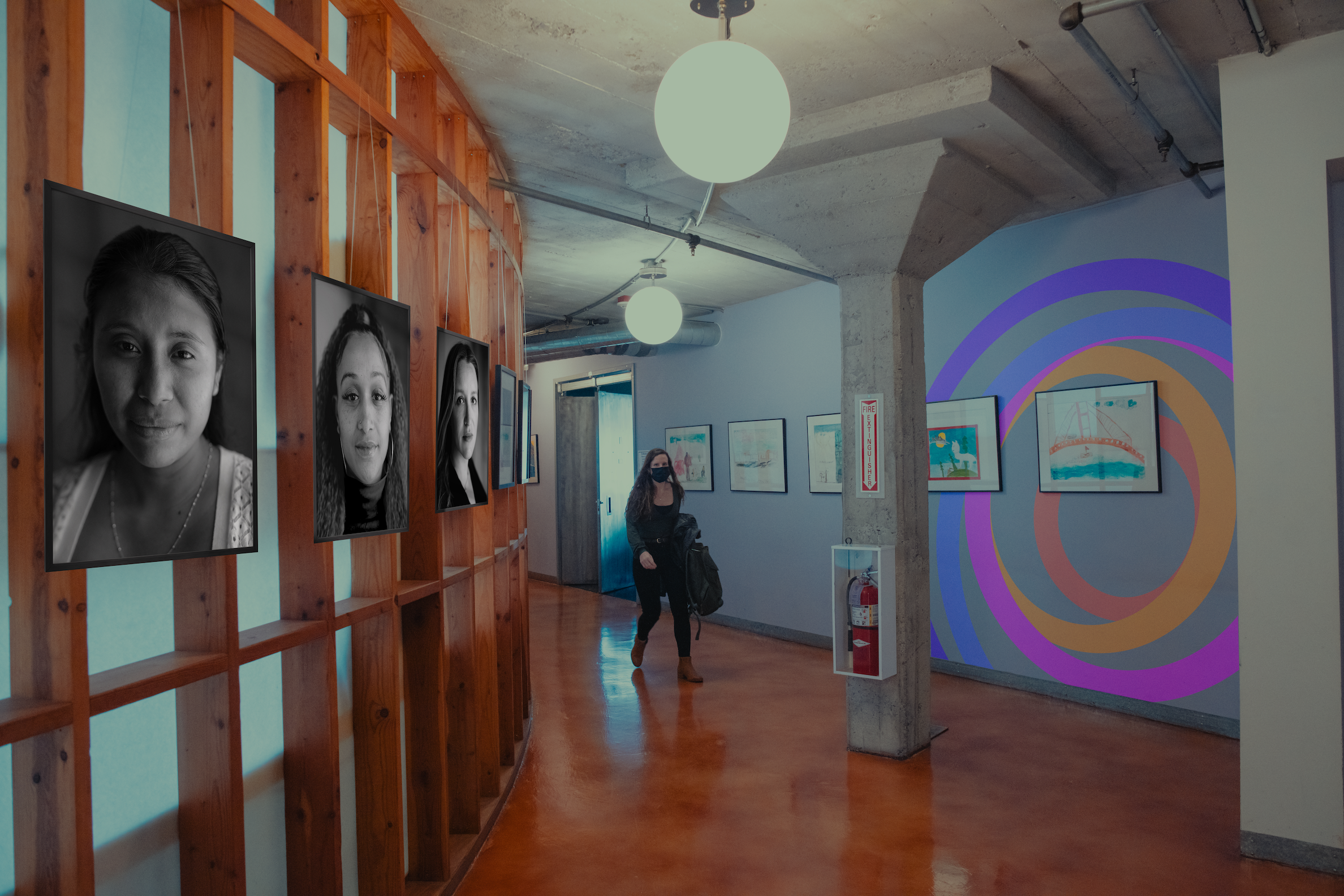
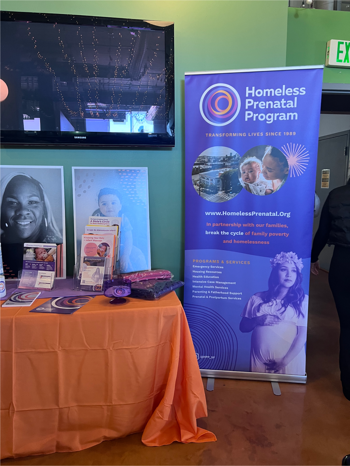
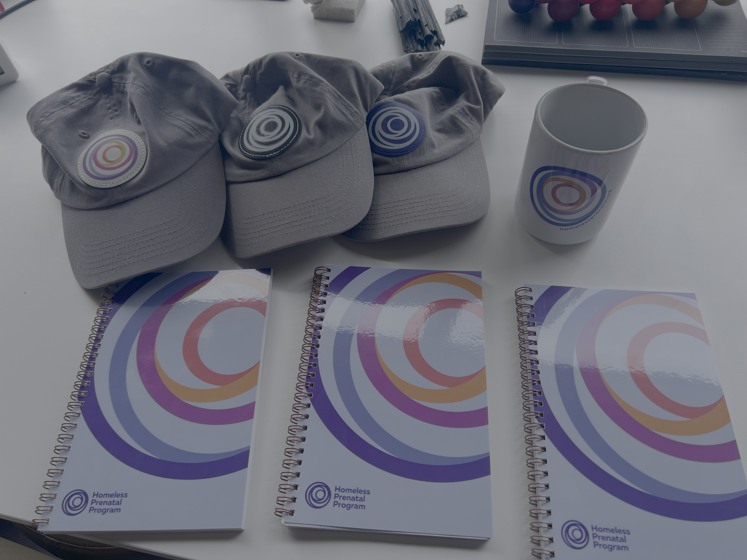
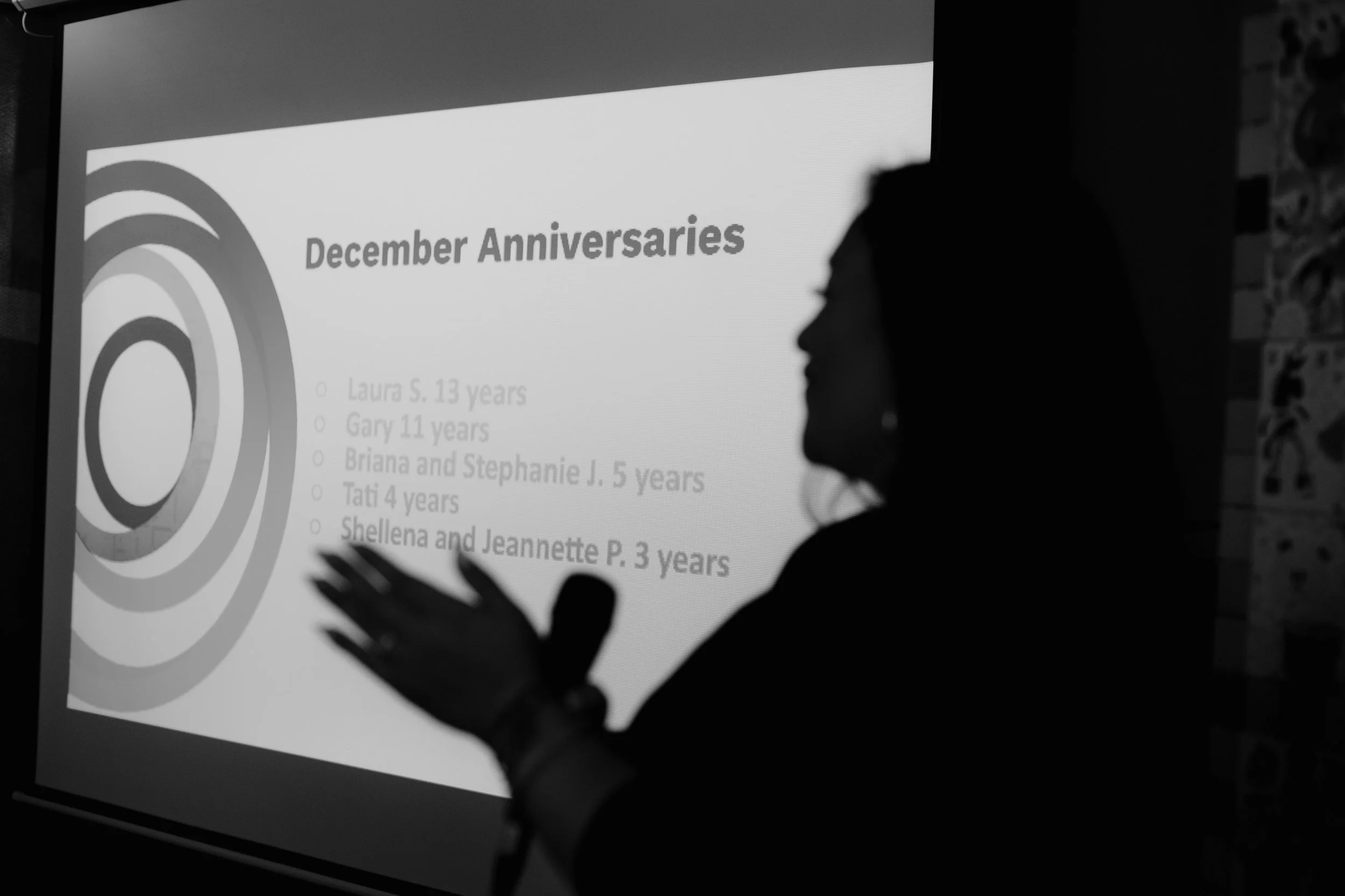
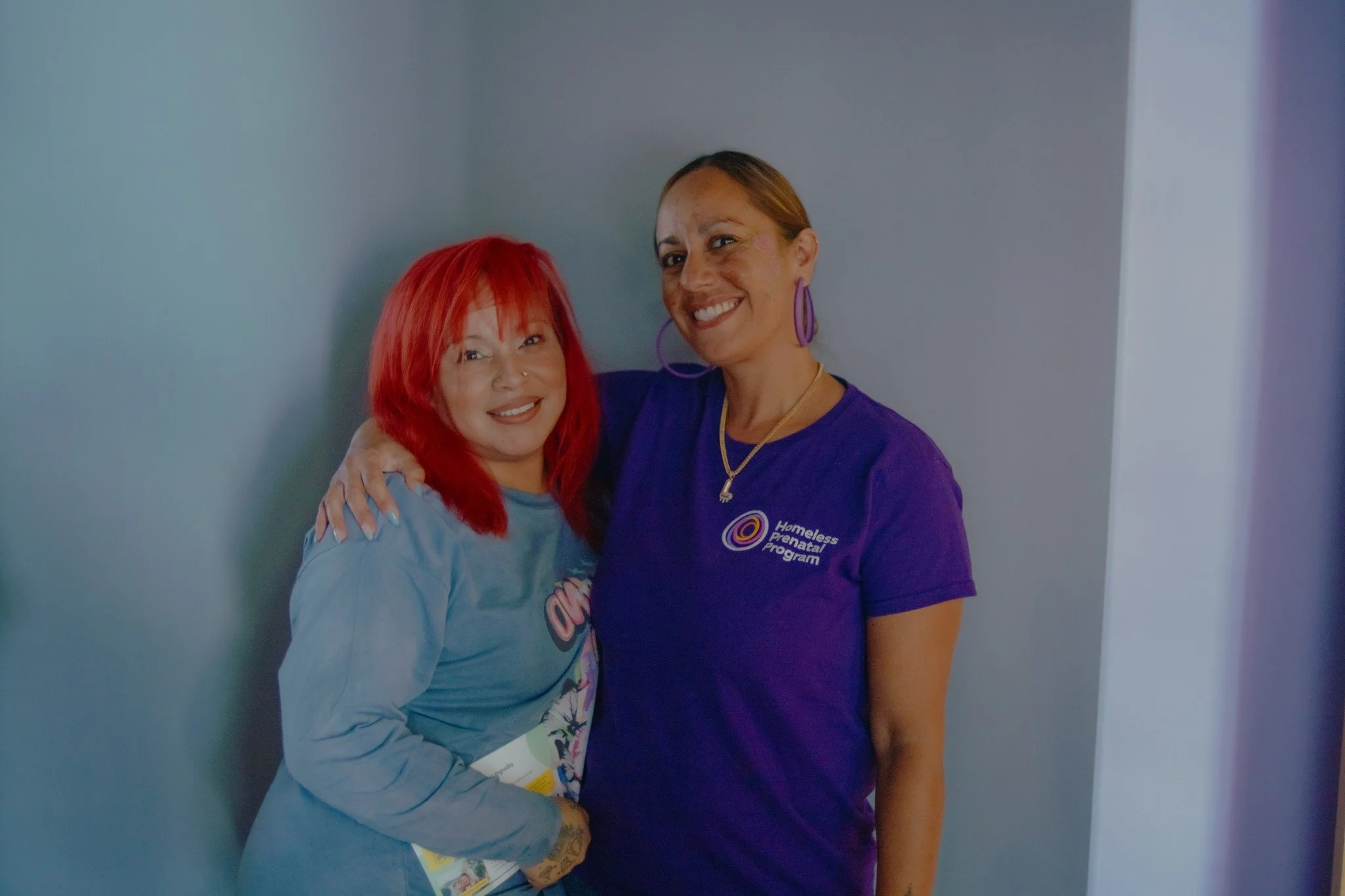
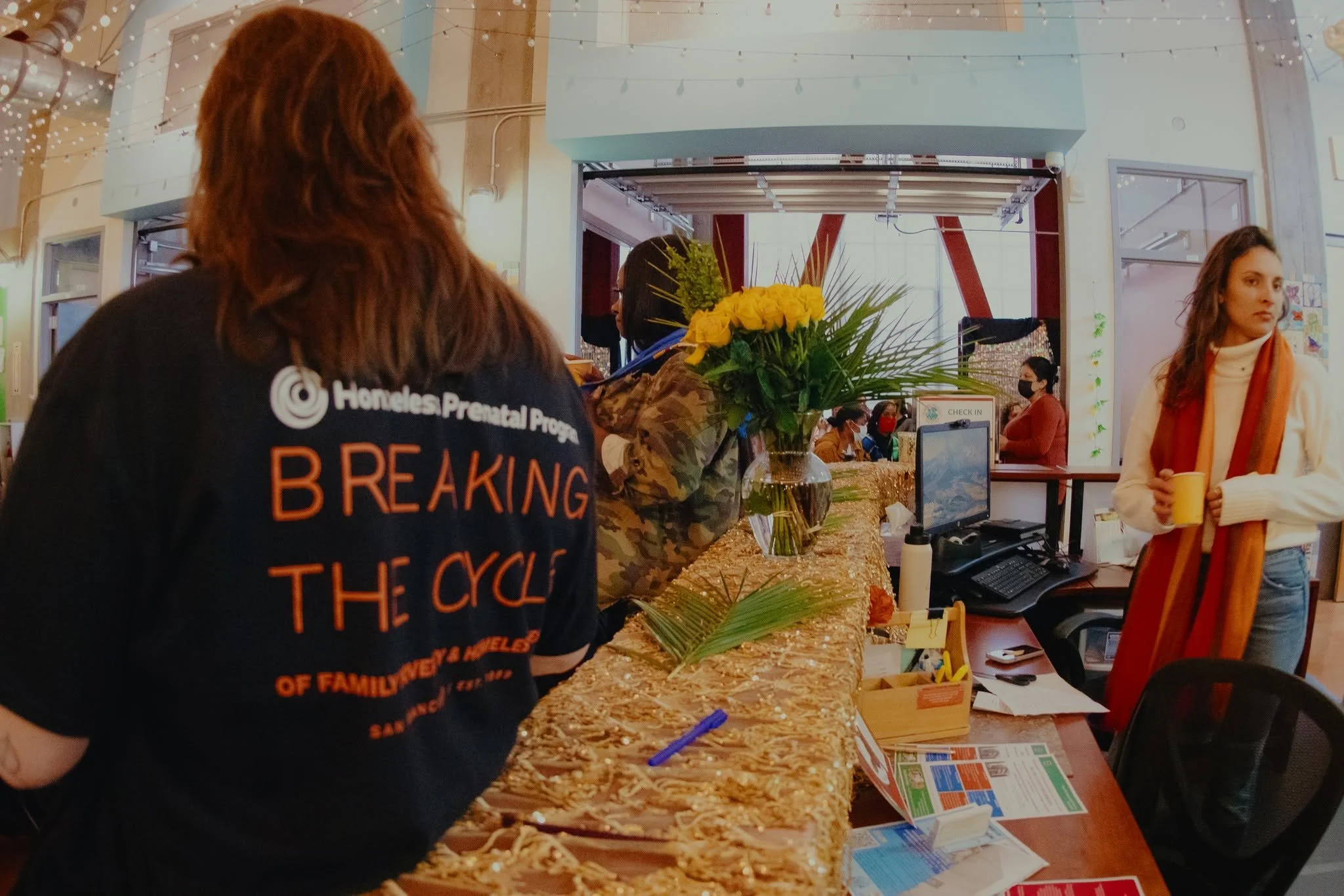
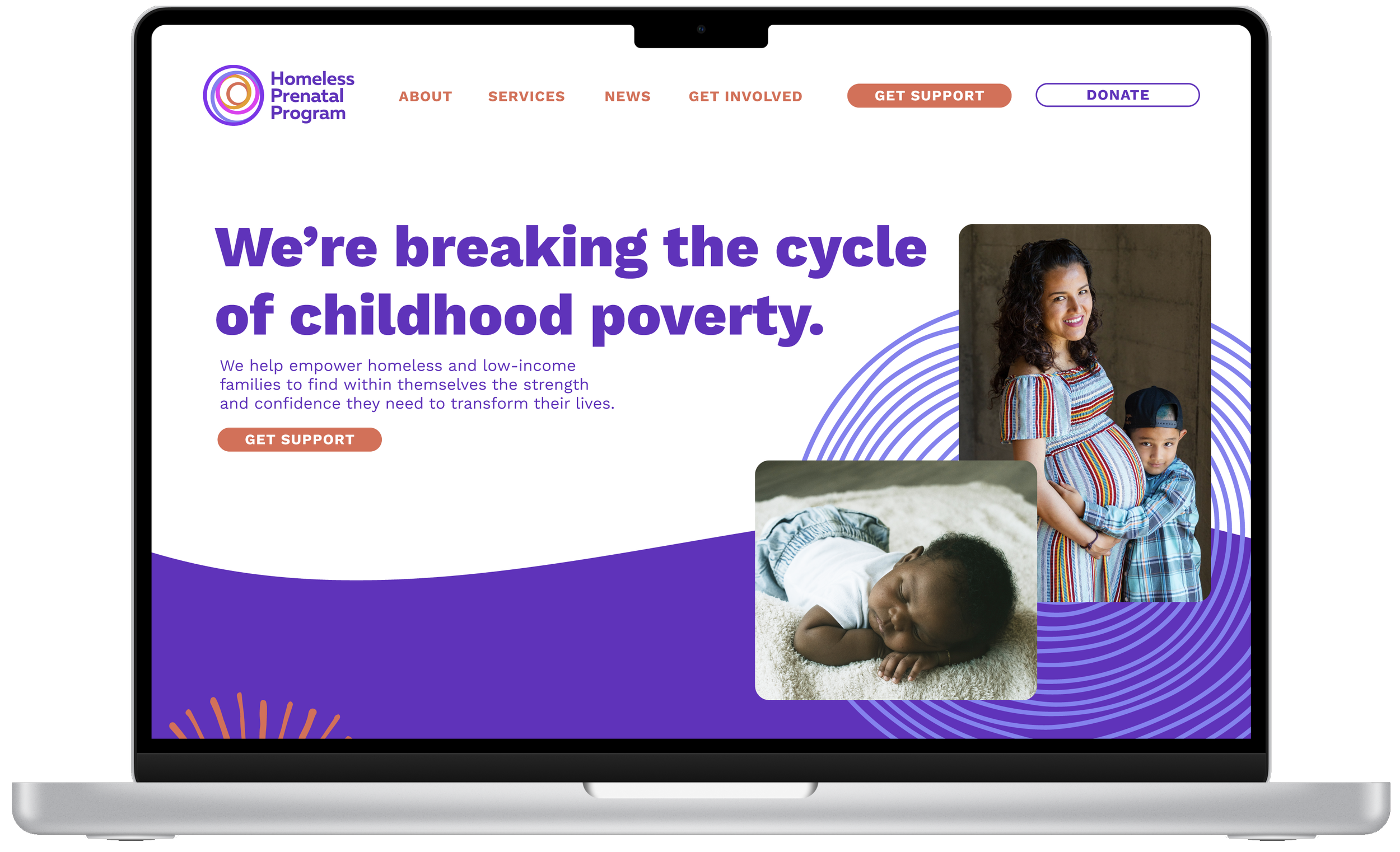
With a changing identity comes the opportunity to improve systems. After the new website went live and HPP’s new mark was published, the next step was to define the new brand. Through internal changes to documents, PowerPoints, and ID badges, we got to know the new colors and other elements of HPP’s look. The branded T-shirts created staff uniformity and improved client safety by enabling better recognition of allies. Agency-wide communications were consistent, and the organization adopted the logo with near-seamless ease, a testament to how well it resonated with the community. I’m so proud of the identity we built for such a remarkable organization.
About the brand
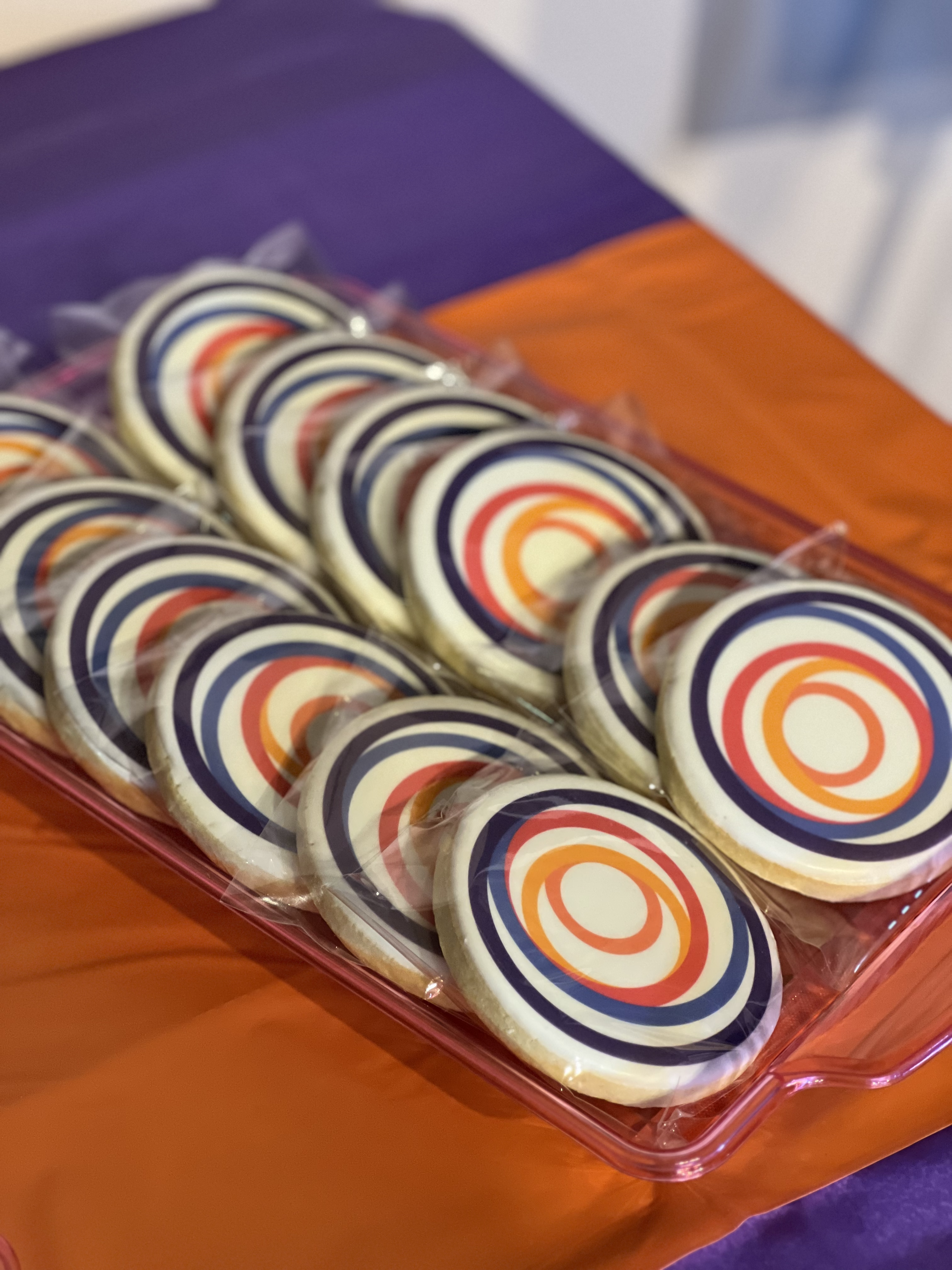
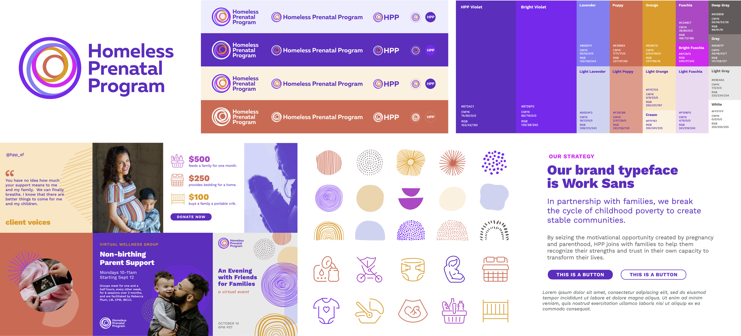
HPP’s new logo is a series of concentric circles that overlay and interact. This mark appears abstract yet is imbued with important meaning — ideas of community and completion. The symbol draws inspiration from the Circles of Care model, in which individuals and their healing are influenced and cared for by a holistic system of communities. It also reflects the idea that actions ripple outward, creating broader change and influence. The circles create a sense of dynamism, suggesting movement and interaction, much like spending a day at HPP. Concentric circles also represent the family enclosure, the encircling of loved ones, and community coming together.
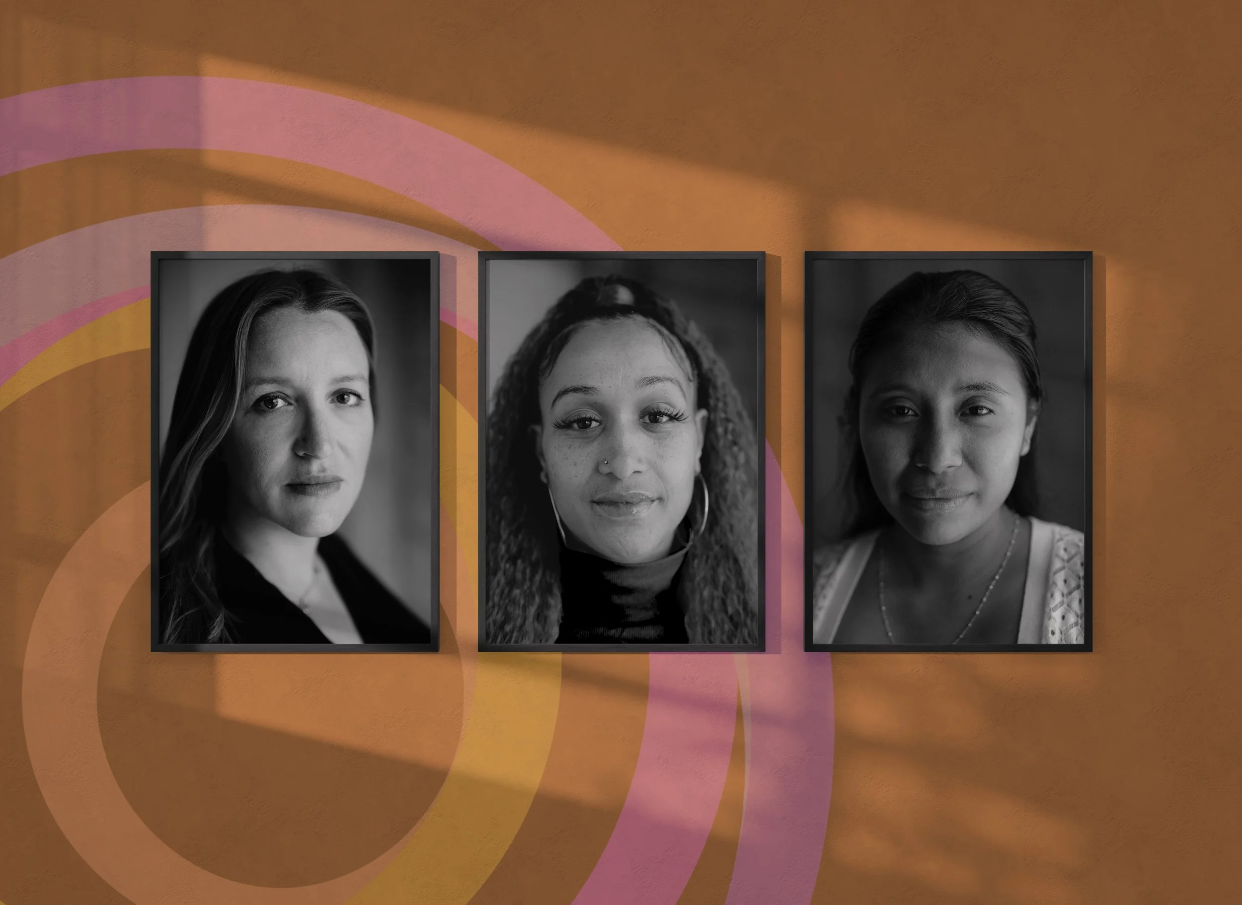
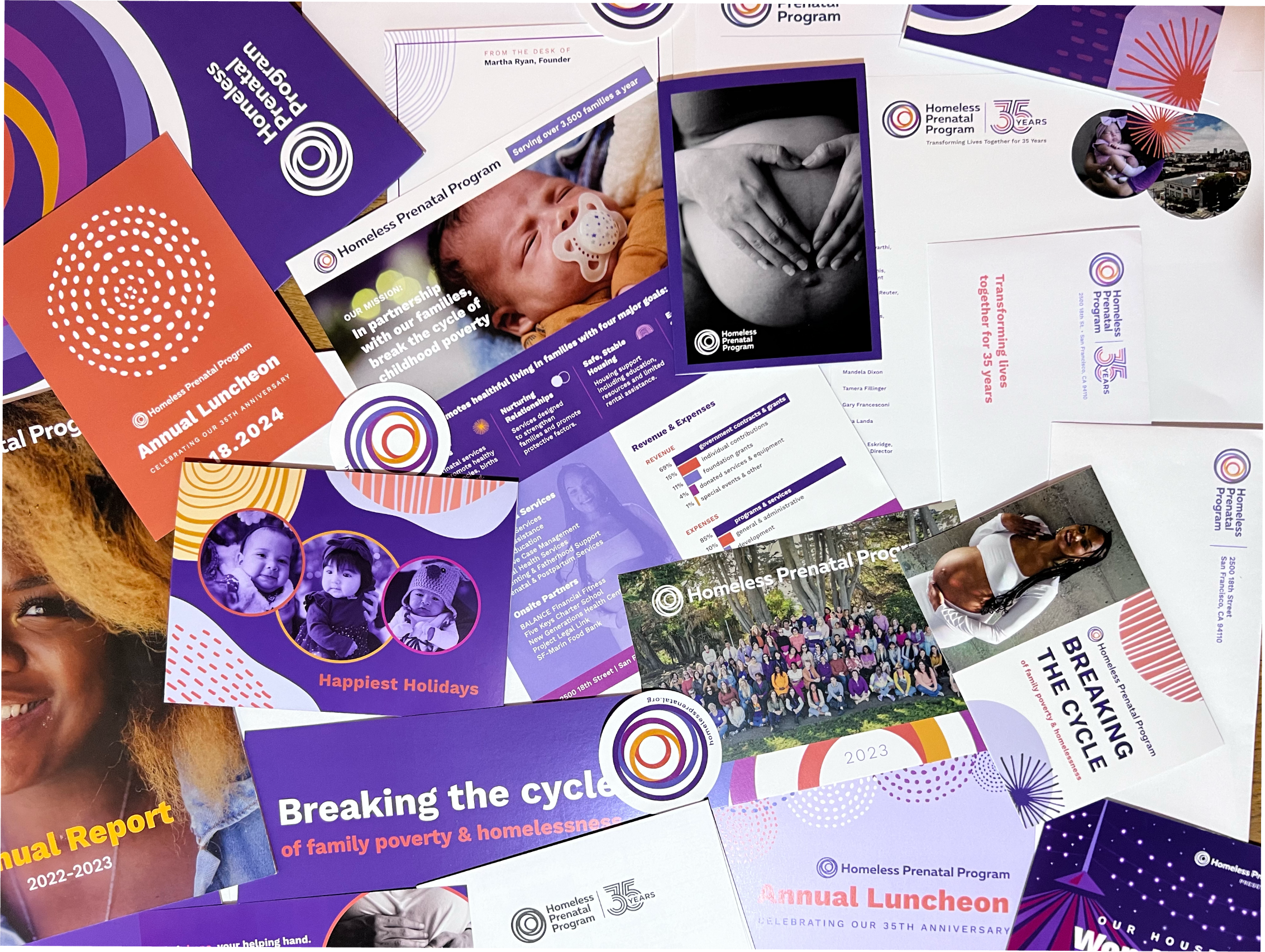
The brand colors are vibrant, bold, and welcoming. The hand-drawn elements add a human touch that mirrors HPP’s approach to service delivery. This identity is meant to be inviting to all and emphasizes the joy and vibrancy that HPP staff and clients bring, as well as the transformative nature of the work to break the cycle of family poverty and homelessness.
Web Design: Cultivate Strategies
Brand Designer: Kayla Jones
Website Development
Internal Rebrand